• Logo design
  • Logo Polls
  • Logo Books
  • Case Studies
  • Copycats
  • Fun
  • Guidelines
  • Inspiration
  • Logo sets
  • News
  • Tips & Tricks
  • Case Studies
  • Copycats
  • Fun
  • Guidelines
  • Inspiration
  • Logo sets
  • News
  • Tips & Tricks

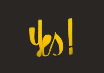
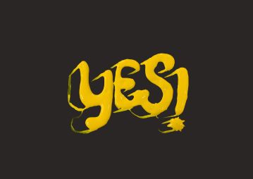
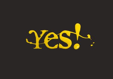
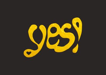
4 David Carson’s YES logos

by Margarit Ralev on April 20, 2009
yesko211
yesko211
yesko021
yesko021
yesko151
yesko151
yesko071
yesko071

It was a long time since I’ve visited www.davidcarsondesign.com and I just digged these for you. Color is yellow because it’s a part of rebranding work for Western Union.

Positive waves, catching the eye shapes.

Tags:

  • David Carson. YES

Recent posts

  • MET has new logo and the Internet is not happy about it

  • The Hidden Meaning In The Logos of Hyundai, Toyota and BMW

  • The Use of National Symbols in Logo Design

  • Google’s New Logo is Evolving Again

  • The phoenix, the brands and the rebirth in logo design

  • Aaron Draplin Logo Design Process

  • 8 Famous Rock Music Logos Explained

  • Reebok’s new logo embodies change

  • 10 cafeteria logos with 10 different appeals

  • Bing Logo: Before and After the Redesign

Popular Posts

All trademarks are property of their respectful owners and are mentioned here for educational purposes only.
Web design by Ralev.com. | © 2007-2019 Some Rights Reserved Logoblink.com